Pret X Tintagel
When presented with the various choices I had for the carousel project, I was torn between Smash Your Brand, and Metal Bending. While both would provide me with experience I did not have, I ultimately went with Smash Your Brand. While metal work sounded enticing, I figured that I would end up in the metal workshop sooner or later, which could not be said for interior design – a subject I had always wanted to explore further.
Taken by Jonathon’s unrivalled dance moves, and a desire to expand my horizons as a product designer, I decided to take a leap, and join the course that I knew would inevitably be more interior design than product design.
Jonathon’s pitch wasn’t very clear on what would be involved, and after completing the project, I can confirm that it was even less clear than I thought.
Initial Assignments
On the first day, we were given two assignments:
The first assignment was to create a “sketchbook” (that ended up as more of a scroll) documenting the interior design choices that we could find in a local shop of our choosing. We were assigned groups, and told to go off and take photos of the shop we chose. My group consisted of myself, Kierra, Amy, Aaliyah, and Emily.
We chose Pandora as our shop because of its interesting interior, that didn’t seem to have showing off it’s products as obviously as possible as it’s main intention. After taking the photos, we returned to our scroll, and started working.

The others chose to type and do various research about the brand online, while I messily sprawled mindmaps over stuck photos, analysing everything I could about the shops exterior. I noted everything I could see, and attempted to come to a reason as to why it was that way was rather than any other.
One detail I’m particularly proud of spotting was on the display cabinets just behind the exterior floor to wall glass windows. One side of the cabinet was curved round while the other remained a sharp corner. The rounded edge was the one facing the door, and could only be there to subtly entice potential customers into the shop.

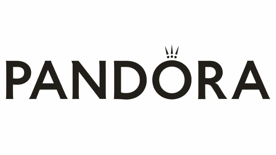
I also deduced whatever I could from the Pandora logo, and typeface, with the help of the teams online research. The company underwent a redesign sometime around 2016 after almost 80 years of consistency. The original typeface was more frilly and fancy, with a more elaborate crown above the O. The new typeface, however, was bolder, heavier, and felt more secure with a more minimalistic crown. While I’m not a graphic designer, I suspected this to be due to the lower disposable income most people have now compared to when the company originally started, or perhaps a shift in target audience to a lower wealth bracket. I thought this because the lack of frills in the typeface may indicate less of a luxurious brand and instead chose a typeface that will give a sense of security in the products quality and longevity, while appearing as the more cost effective option.
The second task was to create a mood board for the next day, consisting of images that represent a brand of our choosing. I chose the cafe chain “Pret A Manger” for their very recognisable interiors, with the cosy material choice – but also because I just like the cafés.
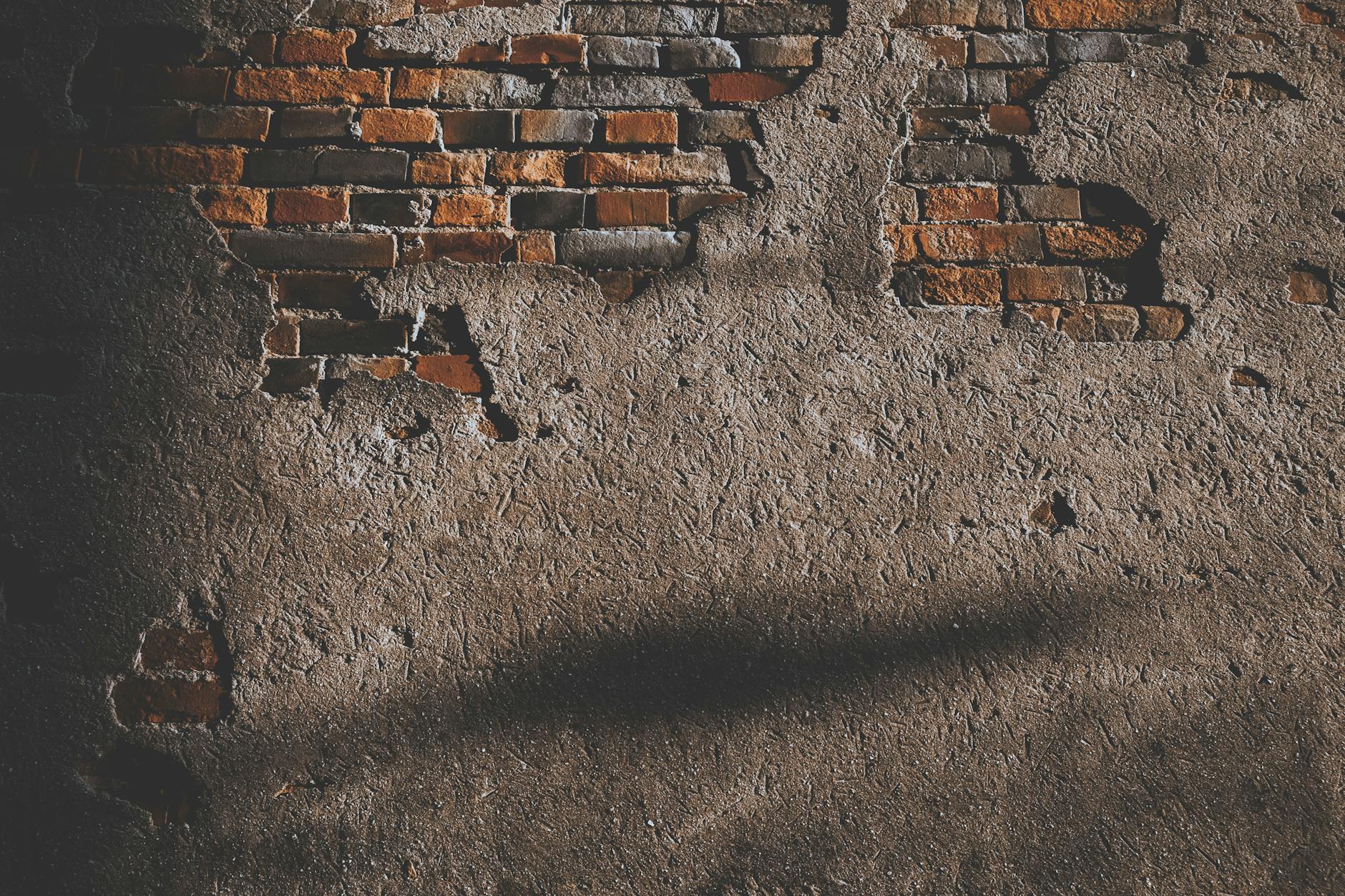
Knowing the course would be orientated around interior design, my mood board focussed mainly on the materials within the cafe. As well as the exposed brick and wood panelling, the interiors mainly use light shades of cream and brown. The use of natural materials, and recyclable plastics on the packaging on the food fronts the image of sustainability.
The Next Day – Whoops! All Mood-boards!
The next day, we all brought forth our mood boards. Admittedly, most people thought harder about their choice, and chose significantly more interesting shops than I did. We looked at all of the mood boards everyone had made, picking out some favourites. Jonathan spoke about the visual design of the mood boards, and putting thought into the design further than just image selection. Jonathan then spoke about the 12 brand components:
With these in mind, we were sent off to create a new and improved set of mood boards with the 12 components in mind. The first step was to go into groups and help each other identify the different parts of the brand.
I decided to go for a grid to help organise my thought later on, in case I would need help trying to identify these brand components in other brands. Admittedly the mood board is slightly unsightly, but I think the clarity and simplicity of the design has it’s benefits.
Our next task was yet another mood board, this time showing the details of our home setting, be that a village, town, city, or country. I chose the village I am currently living in when not at university, Tintagel. The village is a beautiful village on the north coast of Cornwall, and is a hot tourist location in summer, due to it being the location of Merlin’s cave, from the legend of Arthur. Jonathan explicitly stated, however, that he did not want “postcard photos” but rather the details of the location that only one living there would pick up.
Some notes on the image selection, pictures numbered from left to right, top to bottom.
- Tarot and pagan culture is huge in Tintagel, with the legend of Merlin and being the location of Merlin’s cave, attracting enthusiasts from around the country. While this is a has an angle as a tourist attraction, it does have an influence on locals, and not just those that believe in it. Yearly Pagan festivals(3) are held, celebrating Gaea (This information is unreliable; as an atheist myself, I do not have a very strong understanding of Paganism).
- I chose a photo of my family playing card games at a local pub, since I thought that it represented the idea of community present within the village, as well as the interior of the ancient pubs.
- The yearly pagan festival is definitely the most Tintagel thing Tintagel has to offer. While I do not personally believe in anything Pagan, hundreds gather every year and dance wearing fascinating dark costumes. It must be quite surreal as a tourist, especially if you don’t expect it.
- The streets of Tintagel at night and in the rain. This is during winter, and shows how quiet and eerie the village can be without the hundreds of tourists that gather for the summer.
- The local area has some of the most incredible cliff lines in the UK and probably beyond. This photograph was taken near Tintagel castle, a landmark of the area, and a popular tourist spot. While the castle is certainly the largest tourist attraction the village has to offer, it also holds value with the locals, offering beautiful walks along the coast.
- The Spar is one of 2 convenience shops in the village, and is where I worked during my gap year. Working there helped me massively with getting to know the local people, and integrate with the community.
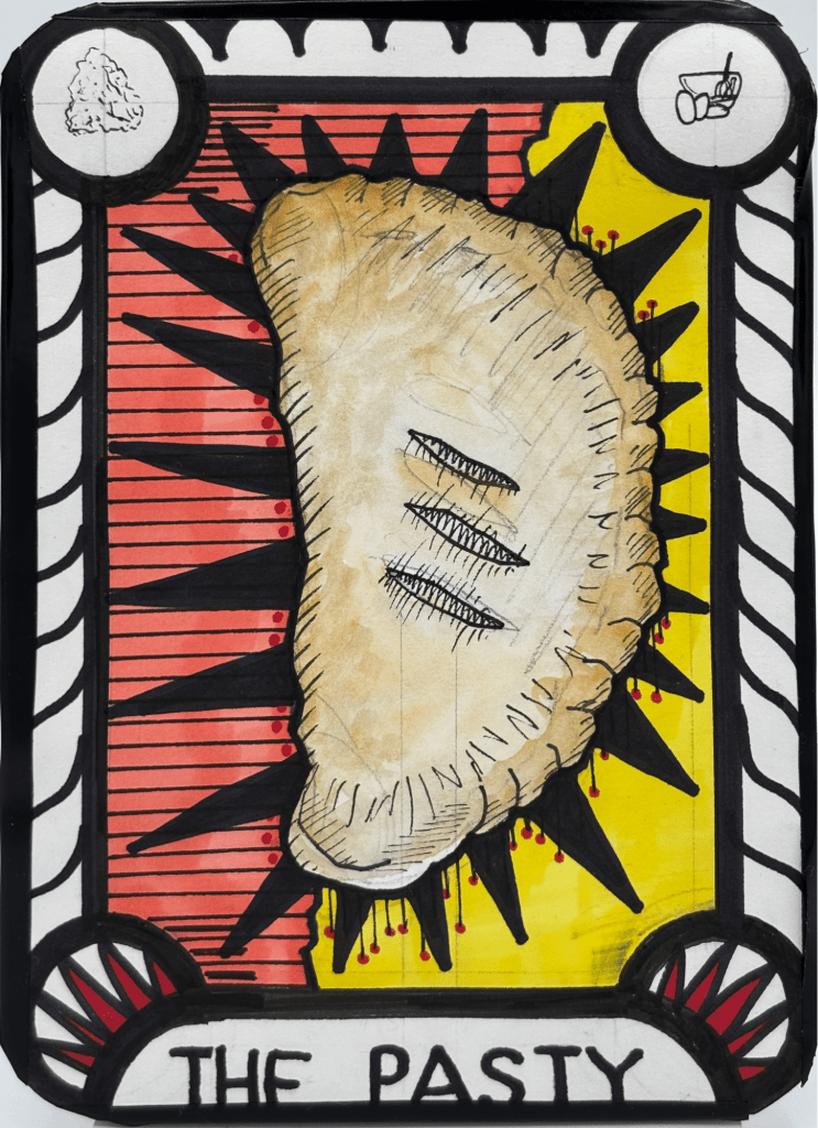
- This picture shows the pastries available in one of the local cafés. I would usually go here for a discounted sausage roll or pasty during my lunch break.
- Willowmoon is a great example of what I mean by “witchy shops”. The shop sells everything one would associate with Paganism: Tarot cards, spell books, crystals, statues, etc.
- The only “postcard” photograph of Tintagel, it is of the sculpture of King Arthur, a hot tourist attraction. I added this, as well as the crowd in front, to symbolise the crowds during peak summer. The population seems to double in summer, with people flocking to Tintagel to see the castle ruins, the statue or Arthur, and Merlin’s cave.
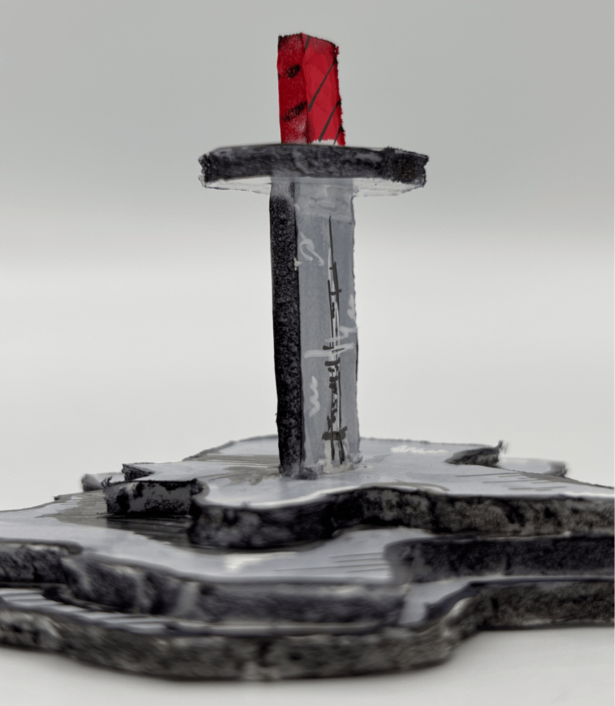
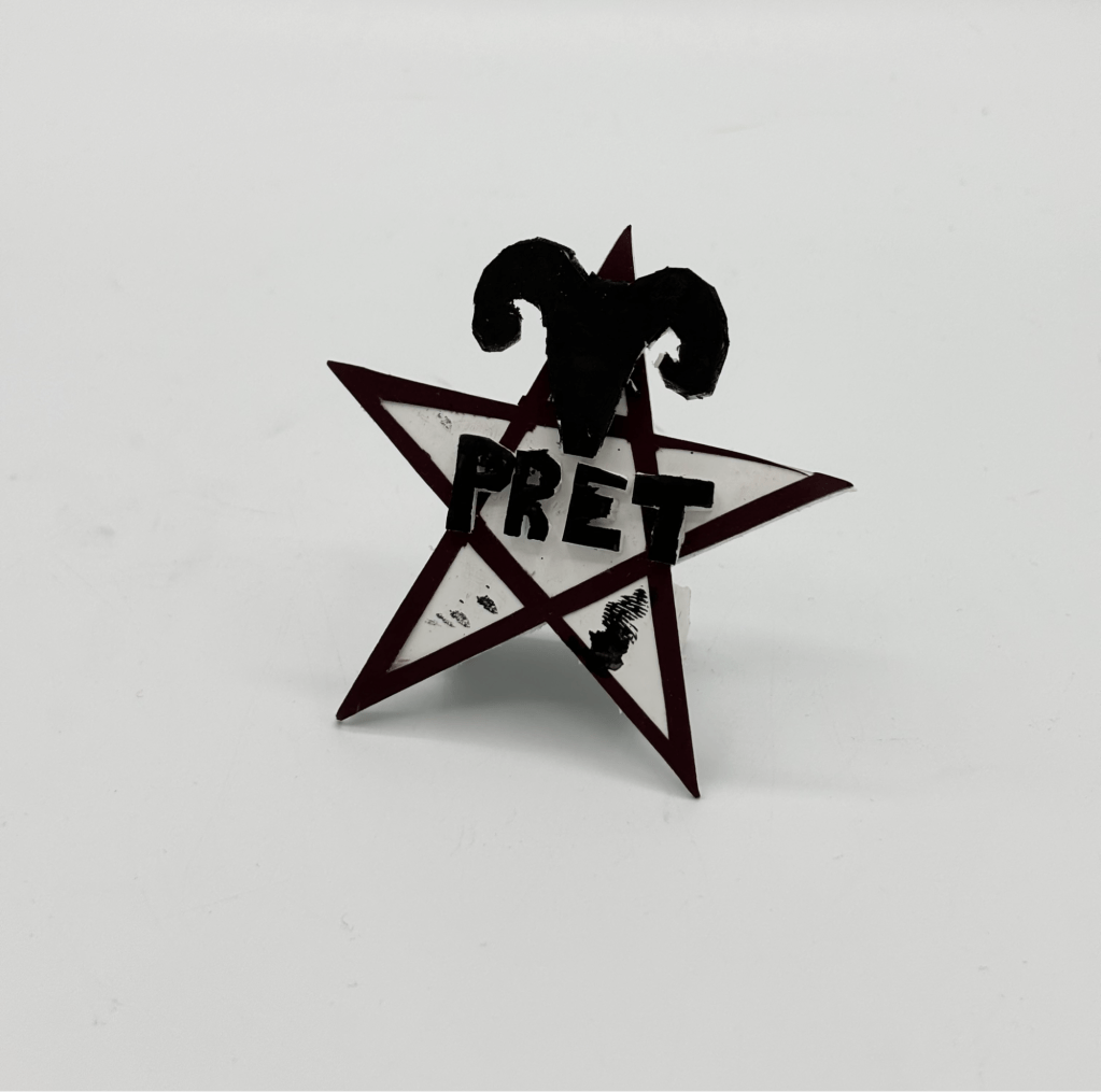
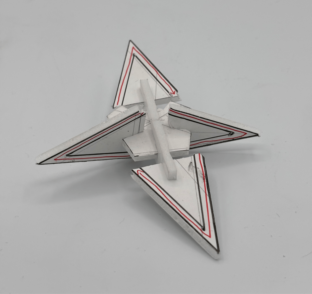
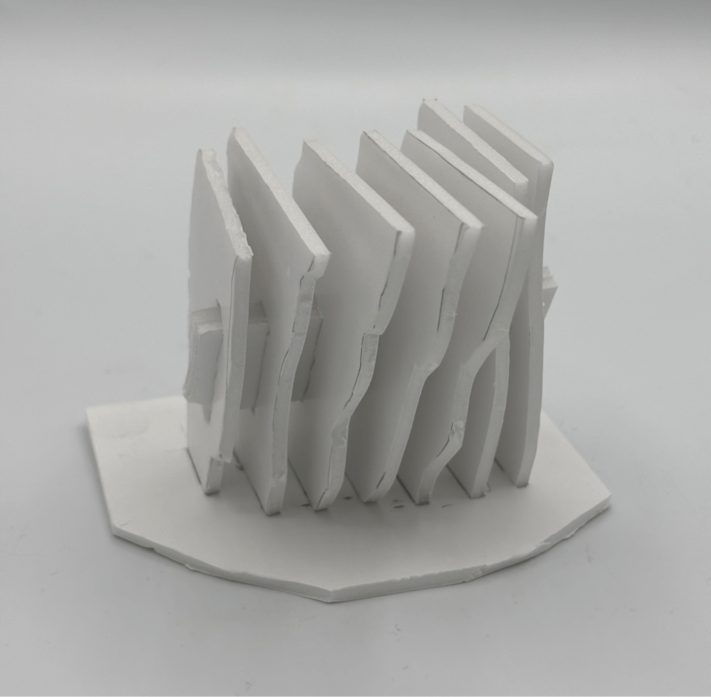
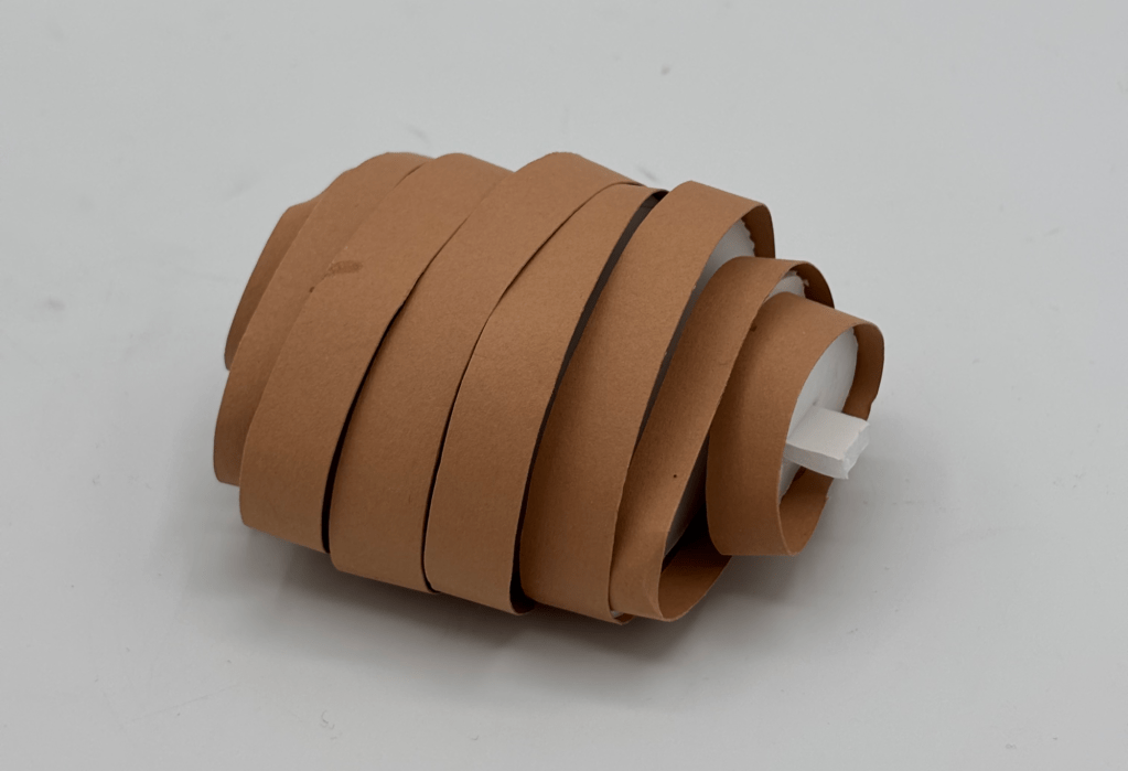
At the end of the session we were briefed with the task of creating 10 abstract models that we felt embodied our home town. This task was to be chipped away at over the rest of the module. My first step was to write down the core aspects of Tintagel on a piece of paper, and then create links between them. I would then use these multiple “components” of Tintagel to create the model. The purpose of the models was to give some inspiration for the final model, which would later be revealed as a pop-up shop in a festival of our choosing. The pop-up would combine both our chosen brand, and motifs of our home location.
My first move towards planning the final model was to write a list of words under “Pret” and under “Tintagel”. I had help from ChatGPT to quickly come up with many of the words, for efficiency. I came up with some concepts by combining two or more words from each side, and by looking at similarities.
I had the idea of a tent, like the kind you might see around a fortune teller. The tent design also had the added advantage of being very easy to construct in the real world, reducing costs of the pop-up.
The issue with my initial tent design, however, was that with the current plan, the model would have to be impractically tall to allow for suitable walking height where the flow of customers would be. The initial A-frame tent design would not work, so I spent some time sketching other possibilities by altering the heights of the columns and imagining how they would contort the fabric.
I used a moody fabric for the tent material to play into the dark, occult theme, while using hardwood dowel that represented a dark wood for the beams. The tent materials used in the model is detachable, being attached to the wooden dowel by snap fasteners on both materials.
I gave the entire a structure a base wrapped in off-white paper, but this was to draw attention to the model, rather than act as an actual design choice. The tent in actually would be placed directly onto the ground of the concert, usually grass or mud, and would have wooden planks and loose wood-chip to provide grip.
